Show, don't tell: automatically personalized content in collateral
 How Clearbit Uses Clearbit: This series shares how we use Clearbit products for acquisition, conversion, and operations.
Before joining Clearbit’s growth team, I once went to a sales conference, and something a speaker said has stuck with me: "You can't expect your sales team to be superheroes without equipping them with tool belts."
Salespeople need good marketing material, software, intelligence, and other tools in order to do their best work. And this has helped me see my own role more clearly — I enable my customer-facing colleagues to scale their efforts by combining data, technical skills, and automation into engaging collateral that saves them time.
This has led to a series of experiments centering around automatically personalized content, a concept that has become a big part of how Clearbit does marketing and sales.
Personalized visuals help us show, not tell, the benefits of our product. And because they’re generated automatically, sales and customer success teams don’t need to customize collateral by hand. Meanwhile, marketing is equipped with dynamic images that can be used at scale in emails, landing pages, chat boxes, and social media.
Explaining our B2B products with personalized visual aids
Currently, Clearbit is one of a whole class of B2B SaaS tools that operates in the underground of a company’s existing marketing and tech stack. We typically work by making other tools more powerful and it can take a while for Clearbit’s benefits to rise above ground in the form of a better customer experience. There are also many, many use cases for Clearbit data, making it complex to sell with one cohesive narrative.
So, when making marketing and sales collateral, we started to focus on a few of our target customers’ top use cases and produced visuals that illustrate their end states.
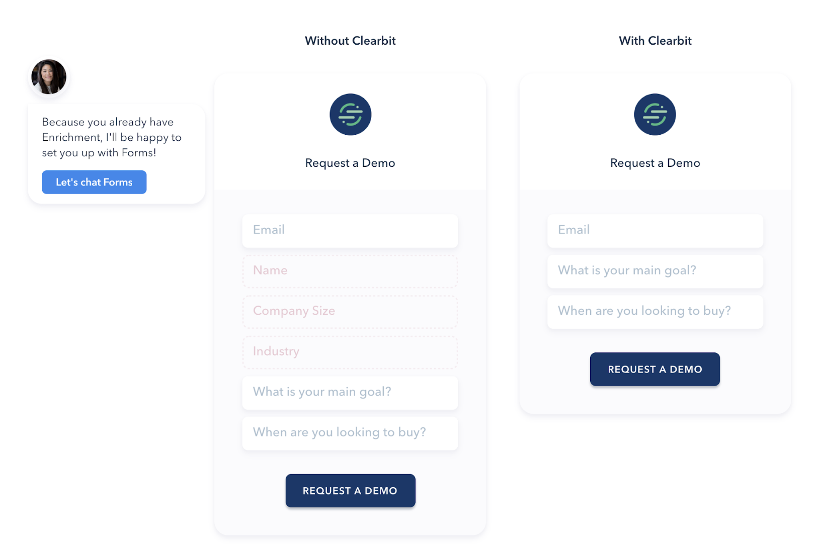
For example, when we want to sell Clearbit Enrichment, we show one or more actual applications — such as the ability to optimize signup forms in marketing automation platforms like Marketo for better conversions. (Customers like Gong.io saw a 70% lift in conversions on their demo request form by plugging dynamic enrichment into the form and removing four or five fields.)
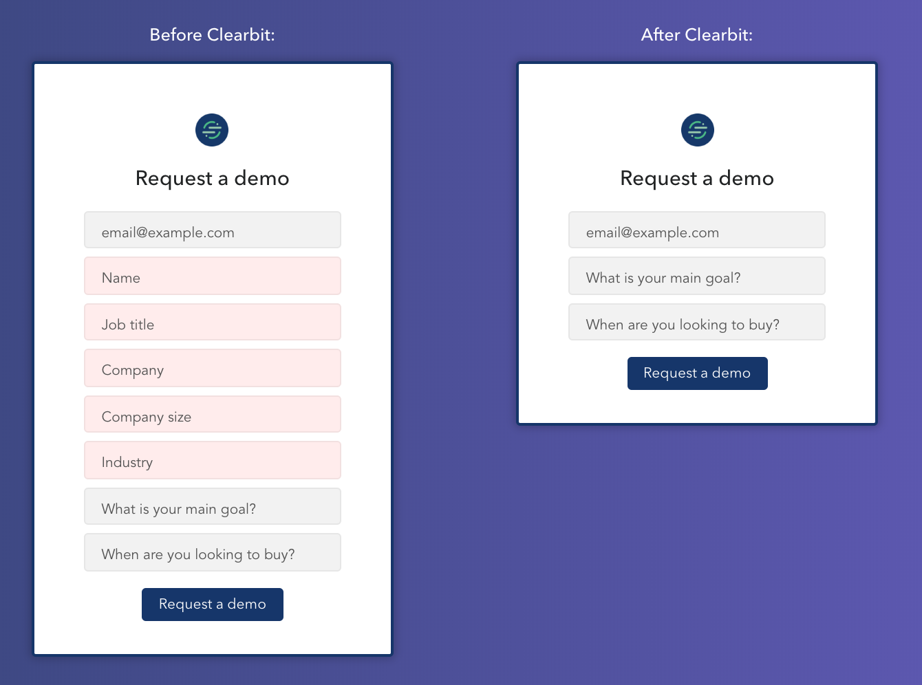
So whenever we talk about form shortening now, we try to show visuals of it. Pretty straightforward.
It becomes more powerful when we layer personalization on top. There’s a draw in seeing an example that actually belongs to you, so we created the ability to pull a domain’s logo and brand colors into the form demo. If you worked at HubSpot, Google, or Segment, you'd see the same form illustration but updated with your logo and colors:
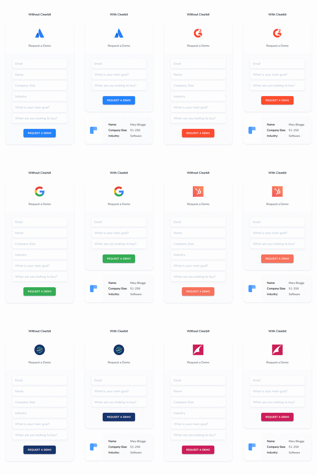
Images like these help our sales team quickly explain Clearbit’s benefits, made stickier with custom branding and personalization, and made easier with automation.
Working together across teams, we’ve created materials for sales, CS, and marketing to collaboratively reach various company OKRs. Here are a couple examples.
Reveal Demo page: Helping Sales sell Clearbit Reveal
My team recently revamped a demo page for Clearbit Reveal when we had a companywide OKR to sell more of that solution. When we interviewed Sales to understand how calls for selling Reveal typically went, we learned that it was difficult to explain all its use cases — no surprise there.
We decided to demonstrate five use cases of Reveal’s reverse IP lookup function with personalized visual demonstrations.
One of these use cases is website personalization. In the following demo — seen by a visitor who works at Segment — we’ve taken a screenshot of Segment’s homepage and dropped it into a browser frame. Then we changed its headline to "Built for the Enterprise," and placed it next to the original, demonstrating that Segment can change their homepage copy for enterprise vs. SMB visitors, powered by detecting who's who with Clearbit Reveal.
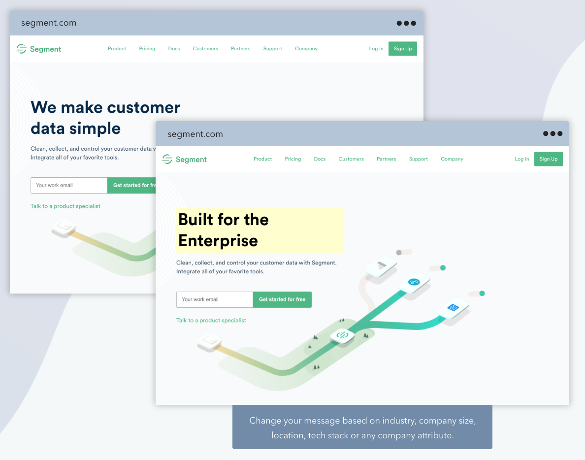
If the visitor worked for Hubspot, they’d see the Hubspot homepage instead.
Throughout the page, we illustrate use cases that automatically pull in personalizations like the visiting company’s name, logo, homepage, and brand colors. We also detect the technology they use, in case we integrate with it, to help recommend the best Reveal uses for them out of the five.
Sales now uses this page in a demo environment during sales calls, and it has led to significant new opportunities and new revenue booked for Reveal.
For a deep dive into the Reveal page and how we made it, check out Behind the scenes: Building a personalized product demo page.
Level up page: Scaling cross-sell efforts
In another example, we had a companywide goal to increase cross-selling of Clearbit products. At the time, this responsibility fell mainly on the Customer Success team, who needed to reach out to customers via email and schedule calls to discuss additional ways of adopting Clearbit.
The CS team is relatively small, so we wanted to help them get better response rates (i.e., more calls booked) without too much custom outreach and emailing.
We ran a few experiments, like sending automated emails and even ad campaigns. One outcome of these was a landing page that illustrated Clearbit use cases that a specific customer should try, based on their plan and usage. When a customer who’s logged into Clearbit visits this page, they'll see use cases they can put into action for free with their current plan, and a few uses they could get by purchasing more Clearbit products.
The page also features the customer’s assigned CSM and showcases little notes from them next to the illustrations.
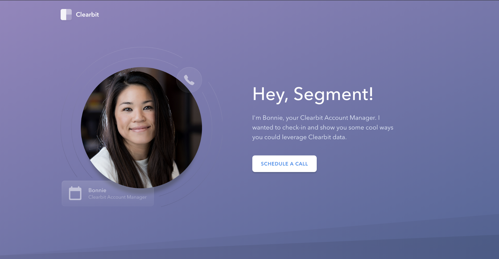
In the example below, the page detected that a customer (Segment, in this case, purely for illustrative purposes) was already signed up for Clearbit Enrichment, but that they hadn’t made use of it to shorten their forms yet. So the page shows that before-and-after Forms image, with the Segment logo on it.
A little message from CSM Bonnie appears, encouraging the customer to call her and set up form shortening for free.
The page goes on to demonstrate another three or so Clearbit use cases, including products that the customer isn’t yet subscribed to.
The page helps Bonnie showcase Clearbit in a visual way, and in a personalized context — all while giving her more reach and efficiency. All she needs to do is send a single page link to her customers via email, and the page automatically tailor itself to its recipient.
Bringing automated personalized content to any marketing channel
The examples of personalized collateral I’ve shared so far all live on landing pages, but the concept can live outside of that too.
We try to think of the customer journey holistically, bringing personalization to the right channels at the right time. We are starting to create personalized images with simple URLs that can be shared in a conversation or embedded in emails.
In other words, why make a customer click through to a landing page when Bonnie sends an email about Forms? We can share the personalized "show don’t tell" image right in the email itself.
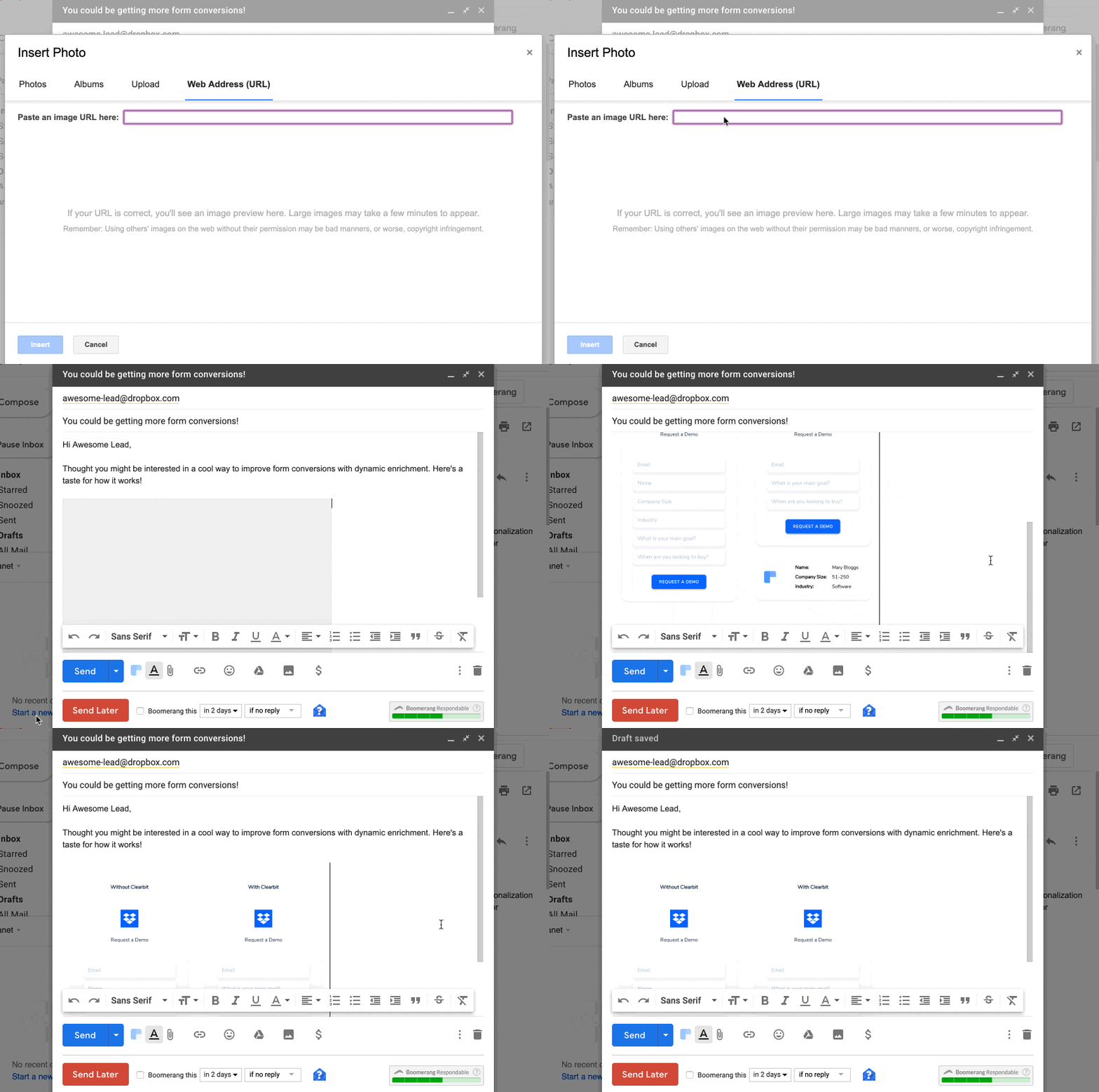
This is powered by a simple embeddable link that produces the Forms image. The URL has a parameter that accepts a domain and updates the image with the domain’s logo and brand colors. Now there's a link that can live in any sales or marketing collateral that can pull in a dynamic image.
Lessons learned
We’ve learned a lot from experimenting with automated personalized collateral. Here are 3 of my key takeaways:
-
Run some quick numbers before taking on a big personalization project. Personalization can sometimes be too niche. I once spent a lot of time building a campaign with complicated personalized imagery for Clearbit’s best customers. Not that many people saw it (double digits) because the conditions were so narrow. Meanwhile, a teammate quickly tweaked the content of an email campaign, and it was incredibly effective in terms of overall engagement and results.
So, check before you create personalized visual collateral: How many people will see it? If you expect a 5% conversion rate, what will the outcome be and does it warrant the effort? It’s important to experiment and innovate, but it’s equally important to tie projects back to results. -
Spend a lot of time interviewing and talking to other teams, especially those that touch customers directly, like sales and customer success. Find places where prospects typically stumble, or tasks that are too time-consuming for individual reps to consistently perform for their entire audience. Can you create an automated solution to scale their efforts, or devise a visual demonstration that simplifies their explanations?
-
If you’re new to creating personalized collateral, start small. Begin by designing just for your ICP or the primary industry you’re targeting. Think about their top use cases and illustrate those. Starting small helps with focus.
And before you dive into creating landing pages, a great place to get your feet wet is by creating a personalized email that pulls in a company logo (try it out with our Logo API). When you’re emailing customers or prospects, you already have their domain name from the email address, so you can use that as a parameter in your email tool to pull their company logo into the message.
Whether it’s on a call, in an email, in chat, or on social media, we want to reach our prospects as a united company with a cohesive visual story — and one that scales the efforts of its small teams. Our reps really are superheroes, and the better their tools, the more companies they can help.

